Problem
Music streaming has evolved into a personalized experience that can be accessed and shared across many devices, yet we lack the tools to break out of routine listening habits. Spotify has remained an industry leader in music streaming, but has fallen short in providing ways users can discover new music organically.
Discovering new music on Spotify has become a monotonous and unsatisfactory experience for long time users of the app.
For this case study, I wondered how users navigate current Spotify features and if there was a way to evolve current music exploration into suggestions of what music to explore beyond a listeners
preference history.
*Educational project as part of Designlab UX Academy. Any Feedback is appreciated!
Duration
4 weeks: November-December 2024
My Role
UX/UI Designer
Tools
Figma
Skills
User research and testing, synthesis, ideation, prototyping, and visual design
Research
Starting with a competitive analysis of other popular music streaming platforms, I was able to weigh the strengths and weaknesses of Apple Music, Amazon Music, Youtube, and Tidal.
Each offer the ability to create a playlist however, they focused more on providing a large music library instead of promoting opportunities to engage with different types music.
Apple Music is an industry lead with how easy it’s platform is to use, easy integration into different devices and screens, and decent sound quality. It is the most similar to Spotify in terms of capabilities and usage.
Amazon Music is not as widely used but users find it helpful when they already have a prime account since it is free to use, connects to Alexa speakers, and can be sharable for larger families at low cost.
YouTube Music was a surprise to find most users don’t really like it as a streaming service on it’s own. Users typically explore it if they already pay for YouTube TV since it comes with an account. YouTube is kept separate from this with users noting they still like it for its original function of watching long-form videos.
Tidal was hands down the best in audio quality and users appreciate that they pay musical artists for their work. However, the user base is comprised of DJs, people who work within the music industry, or people who care a lot about sound quality versus
casual listening.
Since the opportunity to discover different types of new music was not actualized in the current market, I conducted a survey with over 20 participants to see how users were spending most of their time and effort to reach this goal on Spotify.
In the survey, this question was key into developing my solution where I was surprised to find Spotify users actively use Spotify promoted and curated playlists. The survey also highlighted an unexpected group of users that abandoned music discovery on Spotify completely.
By gauging how users were already interacting within Spotify to discover new music, I was able to shift the focus of the problem area being about expanding the search tool into how I could adapt playlist making to incorporate more new music discovery.
With that in mind, I interviewed four Spotify users between the ages of 24 and 32. Some key questions I asked were:
What do you think of current features like blend mode and discover weekly (Spotify-made playlists)?
How do you discover artists or songs you have never heard of before?
What do you think about integrating songs you have never heard before into your Daylist (daily Spotify playlist?
Synthesis
Four insights emerged from the interviews regarding Spotify’s functionality of marketed features where users felt disappointment over how to differentiate and use them.
The interviewees aligned with the survey findings where Spotify-made playlists were heavily used, but they ultimately felt discouraged to discover new music.
They reported feeling irritated by repetitive song suggestions, the overwhelming amount of Spotify playlists that sounded the same, and the limited amount of song suggestions that were completely new to their saved songs.
Sam doesn’t know how to find new music without spending a lot of time searching for specific artists or looking at long comparable song lists that are on each navigation page. His main goal is to not waste time sorting through songs to find something new and to expand his current listening library.
Which lead me to wonder:
How might we guide users to discover new music that integrates into their library?
Having the interviewees share with me their main pain points, I was able to understand the reoccurring issues avid Spotify users faced during their music discovery journey. I created this persona to represent the daily Spotify user who has trouble discerning different Spotify-made playlists and is frustrated with getting the same song recommendations repeatedly.
Ideation
How did I arrive at Spotify Jukebox? I started sketching ideas of how to integrate a new feature into the current framework of Spotify, focusing on the navigation constraints and overall UI feel. Some early stage ideas included:
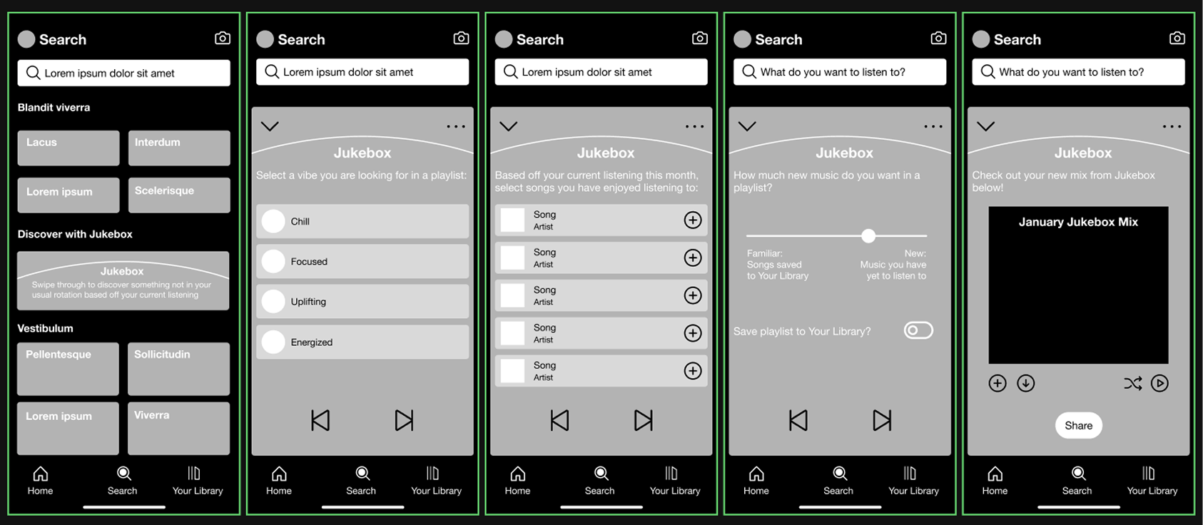
Outlined in the User Flow and Task Flow, I landed on developing a new kind of playlist builder on the search page to be the go-to place users can develop a playlist specific to music discovery. I wanted to avoid adding more noise to the already cluttered homepage where users expressed overwhelm. It seemed like the perfect fit to add a new feature to the search page, expanding its function and capabilities to allow users to include a certain mood or vibe to search with to find curated music unknown to them.
User Flow
Task Flow
Design
Designing the mid-fidelity wireframes revealed how crucial it was to draw attention to the new search page and engage with users in a way that felt new while maintaining the current Spotify design system.
I tested the first playlist prototype with 3 users and received feedback that the meaning and functionality of the choices displayed was not clear. Users were confused on what a “tie” meant when it came to song preferences and that selecting a vibe would be easier than guessing what a vibe could be through song suggestions. I learned from this round that incorporating already listened to songs, made the playlist builder feel like an already explored Spotify method and not aligning with finding totally new music.
I tested my second iteration of the playlist builder with 3 new users after integrating changes from the first round. I deliberately added in the vibe selector to be the first choice users needed to make, but again users reported that the buttons taken from other playlist screens didn’t align well with the action needed to continue through the flow. Overall, users were pleased with the ability to filter and customize the playlist builder but needed refining when it came to feeling seamless in the current
app framework.
Branding
During user testing, I also developed lean branding to prepare for going into High Fidelity. I selected the name “Jukebox” because of it’s nostalgic representation of a users input to select music to match their mood and a sense of familiarity to the music played when they don’t know what a song is called or what could be coming up next.
I took motifs from preexisting Spotify playlists to form the visual identity of Jukebox, creating a fun introduction to the new feature while making sure it felt right at home among Spotify’s
current framework.
High Fidelity Testing
Taking in what I had learned from my mid-fidelity testing, I applied the lean branding and changes needed to form a more cohesive flow. Below, the action buttons at the bottom of each screen were changed to include direction which helped users move through without confusion. The addition of this and better descriptions on each page with the branding really helped users understand the flow better. I tested these screens with 3 new users within my target audience and received little feedback about making any further structural changes.
Based upon these results, I was able to finalize my design choices to achieve an integrated feature that blends user input with music generation to create a new listening experience. Bringing Jukebox to life was so rewarding and focused on studying Spotify’s current system to successfully implement their UI and interactions onto something new.
Spotify Jukebox is your one stop shop to exploring new music to add to your listening library. A different way to make a playlist and explore what fits your mood. With Spotify Jukebox, you can add just the right amount of new songs with old favorites, making music exploration ever-changing and fun.
Using the arrow keys, click through the final prototype.
Growth Opportunities
Solution
This project taught me the importance of listening and detecting a users needs through interaction. I think I found my most important pieces of information when I interviewed people who used Spotify and watched them go through the app on their own. I initially focused on a solution based around reimagining the search screens, which would have been useless if I hadn’t looked at users main touch points first. I would be curious to see if I could push this playlist builder idea further by adding more options and testing even more ways to communicate different moods into different kinds of music.
Working within the constraints of Spotify’s design system was a very real world scenario but proved to be the most fun part of the project for me. I really enjoyed studying the design system to make sure my final screens looked aligned. If I were to approach the project again, I would like to explore edge case scenarios and develop more choices for users to select to further personalize the experience. Additionally, it would be great to add AI into the user flow to further push the boundaries of playlist algorithms to be more receptive to the users needs and music discovery.
If you have read this far, thank you so much for looking through this case study and supporting my work!


